- LANDSCAPE TOOLBOX
- PLANTS
- DESIGN
- Introduction to Design
- Questionnaire
- Principles of Design
- Creating the Design
- Drainage
- Plant Design
- Installing the Garden
- Working with Professionals
- IRRIGATION
- Introduction to Irrigation
- Plant Water Needs
- Before You Design
- Smart Controllers
- Types of Irrigation Systems
- Eliminating Run-off and Overspray
- MAINTENANCE
Principles of Design
Creating a garden is much more than choosing plants and deciding where they should go on your property. The ultimate goal of designing a garden is to produce an area that is both visually pleasing and in functional harmony with the owner’s lifestyle.
Professional landscape designers often utilize basic design principles when outlining a new project. Derived from the fields of art and science, they are as follows:
Unity (Connections)
Function (Utilities)
Simplicity
Scale (Proportion)
Unity
Unity is coordinating the styles, building materials, sizes, and colors of individual pieces of the property in such a way as to create a visually pleasing whole.
An interior room with a paver stone floor creates a flowing unity to the outdoors when connected to a patio of the same material.
A brick walkway works very well when the same color and size brick has been used as a decorative trim on the home.
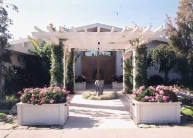
Design: Pedersen Associates, Landscape Architects
The house and pavilion are unified through color.
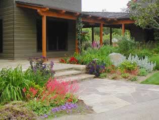
Rustic style, clean lines, and repetition of color scheme allow the porch to connect the home with the garden.
Function
For our purposes, function refers to the incorporation of items that are necessary for the everyday operation of the household, or care of the garden, into the garden design. These would include garbage cans, storage lockers, tool sheds, woodpile, compost heap, etc. Reminders and suggestions for items that should be unobtrusive but easily accessible:
-
Trash and recycling containers – place on a level area with street access. Keep away from entryways and windows to avoid unpleasant odors from entering your home. If there is a possibility of attracting wild or neighborhood animals, consider a locking storage shed.
-
Tool or storage shed – should be weatherproof, with option to lock.
-
Woodpile – should be protected from rain. Avoid stacking directly against any wooden structure. Stack wood onto pallets or tarp to separate the wood from the ground. Check with your local fire department for fire codes on woodpiles.
Simplicity
Keep it simple. Less is often more. The first, and most basic element to consider is your home. It is the central feature of your property. Let your home set the tone for the garden layout. Highlight, contrast, and/or coordinate what you feel is attractive. Accentuating positive features and minimizing negative creates a setting for your home that is both harmonious and pleasing to the eye.
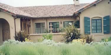
Design: Suzanne Biagi, Sculptural Landscapes
The detailed, Mediterranean-style home is complimented by the simple lines and color of the stiff-leafed phormium. In turn, the phormium is saved from being too harsh and spiky by adding the softly flowing lavender.
A few tips to achieving simplicity:
Use repetition to avoid a fussy, busy design. If you utilize too many plants that are dissimilar, the eye doesn’t know where to focus and will tire easily.
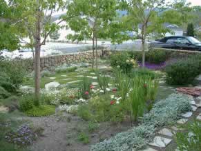
Too many differences: plant types, colors, textures, and building materials create a chaotic, busy look.
Occasionally, it is possible to add a little "spice" in the form of a few unique plants placed strategically in the garden.
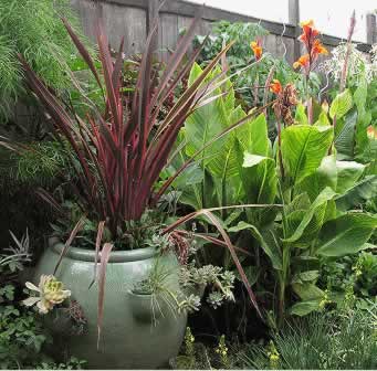
Design: Michelle Derviss, Landscapes Designed
The rich, red, New Zealand flax coupled with the bright, orange blooms of the tropical Canna creates drama.
Consider coordinating colors, textures, and styles of patios, decks, or terraces with interior floorings. Flooring is a big budget item. If an exact match cannot be found, try matching color, shape, style, and/or texture as closely as possible.
Choose one material, such as brick, rock, or stones, to be used for all, or most, of the non-living features. Pathways, walls, steps, and/or benches made with the same material, "pull together" or unify, a garden.
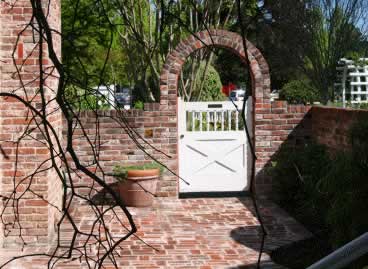
Luther Burbank Home and Garden
The brick chimney (left) set the tone for the patio and arched garden gate.
Scale (proportion)
Scale refers to the size of elements on your property in relation to each other. Scaling elements correctly results in visual balance. A towering tree may compliment a tall office building; yet dwarf a single story home. A gazebo surrounded by several shrubs and trees in one corner of the garden would create a visually unbalanced effect when paired with a small ornamental pot surrounded by low perennials in another corner. The difference in volume and size between the two areas of the garden would be the problem.
When considering the scale of elements in your garden, remember to compare your idea to the scale of the human body. For instance, the eye generally follows the top line of a dominant structure built at "eye level" such as a fence or wall, thus, unintentionally drawing attention away from the rest of the garden. This is also true if you plant a shrub next to the home that obscures windows and doors at maturity. The plant’s size will be out of scale with the home.
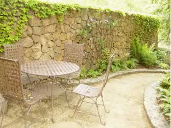
Design: Jack Burgi Landscapes
The garden wall is in proper scale to the table and chairs: offering privacy whether sitting or standing.
Follow these rules of thumb to get an idea of how to use scale.
Choose an element such as a tree, bench, or sculpture that will be the main focus of the garden. All other features should be subordinate (smaller scale) to this element. For example, a small flowering tree is the right proportion for a small private patio.
Choose your favorite plant and coordinate the other elements with that plant's overall size, leaf size and color, and bloom size and color, etc. This strategy helps to unify the garden and keep the garden in proportion.
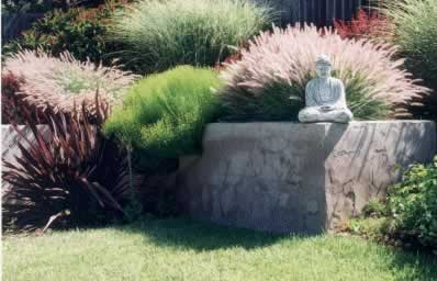
The eye focuses on the sculpture; the dominant feature of the garden. Framing the sculpture is a softly colored, airy plant whose shape provides a complimentary backdrop and adds balance to the rough texture of the garden wall.
When planning for paved surfaces, large wide pathways and decks are better than undersized. Pathways should be at least five feet wide so two people are able to walk side by side comfortably. Walkways on the side of the house can be narrower as they are used primarily to get from front to back, access trash cans, etc., rather than taking a stroll through the garden. Also, wide surfaces lend simplicity to the garden that is pleasing to the eye, are low maintenance, and can be toned down (softened) with plants.
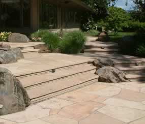
The wide, flag stone steps and patio convey a sense of welcome, permit side-by-side strolling, and safety.
Don't be afraid to be bold. Keep it simple - choose a bold color or size, then build on that color or size scheme. Avoid offering too much variety. One or two large potted plants are more restful to the eye than many small pots.
